I just saw this headline pop up in my notifications from the LA Times:
There’s a lot going on here. The image shows two people in masks waking past half a dozen people staring at . . . something. What are they looking at and what (other than the masks) does this have to do with COVID? ¯\_(ツ)_/¯
The “worst summer . . . in years” is clarified in the subhead:
California’s strongest summer COVID wave in two years is still surging, fueled in part by the rise of a particularly hyperinfectious FLiRT subvariant known as KP.3.1.1.
So “years” means “two years”. English is funny because that could mean 2024 was worse than 2023 and 2022 or it could mean it was worse than 2023 alone. Spoiler: the headline just means summer of 2024 has been worse than 2023.
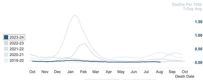
The California Department of Public Health still maintains a COVID dashboard. Thankfully it includes data about other respiratory viruses, particularly influenza. So we can see from the data how bad the “particularly hyperinfectious FLiRT subvariant” has been:
It’s hard to tell from this chart, but the 2023–2024 season (which includes the summer of 2024) hugs close to the 0 line. The most recent datapoint from August 3, shows a 7-day average of 0.0057 COVID deaths per 100,000 people living in California. Here’s all 5 years:
| Respiratory season | Deaths per 100k on August 3 |
|---|---|
| 2019–2020 | 0.3667 |
| 2020–2021 | 0.1125 |
| 2021–2022 | 0.1235 |
| 2022–2023 | 0.0310 |
| 2023–2024 | 0.0057 |
Alright. Maybe deaths aren’t the right metric anymore. We do a much better job keeping people from dying. So about how positive tests?
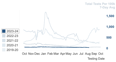
Again the line for 2023–2024 looks like it hugs the 0 line. I won’t do the table of numbers thing again, but the rate of positive COVID tests for this summer and last are notable for being so very low. We’re talking ~50 positive tests for every 100k people compared to 250 to 1,000 in the pandemic years. The news (if there is any to be had) is very good. The vaccines are working and our lives have returned to normal. The pandemic is over and newspapers should stop pretending it isn’t.
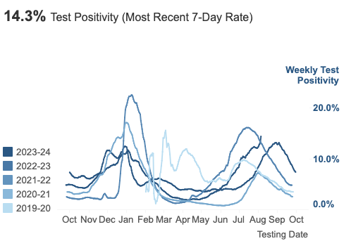
I did find one chart that shows 2023–2024 could be the worse than previous seasons:
This is just the rate of tests that come back positive. The denominator is tests administered, not population. So the way to square this data with the previous chart is to assume we are taking fewer COVID tests now compared to when the pandemic was at its height. Since school is starting back up, I have some anecdotal data. Our kids are actually going in person and haven’t been required to get tested.
So if there are fewer tests being given, the tests that are being done are likely to be testing people with symptoms of COVID. Unsurprisingly, people with symptoms are more likely to test positive. So when we stopped testing lots of people without symptoms, the positivity rate increased. That’s good sign!


