OpenSSL’s documentation is a bit of a mess. The library is massive, not everything is documented and the documentation that does exist can be hard to use. This is especially true for people who are starting with no knowledge of the library. It all starts with the home page:
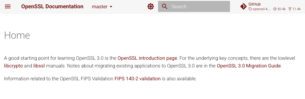
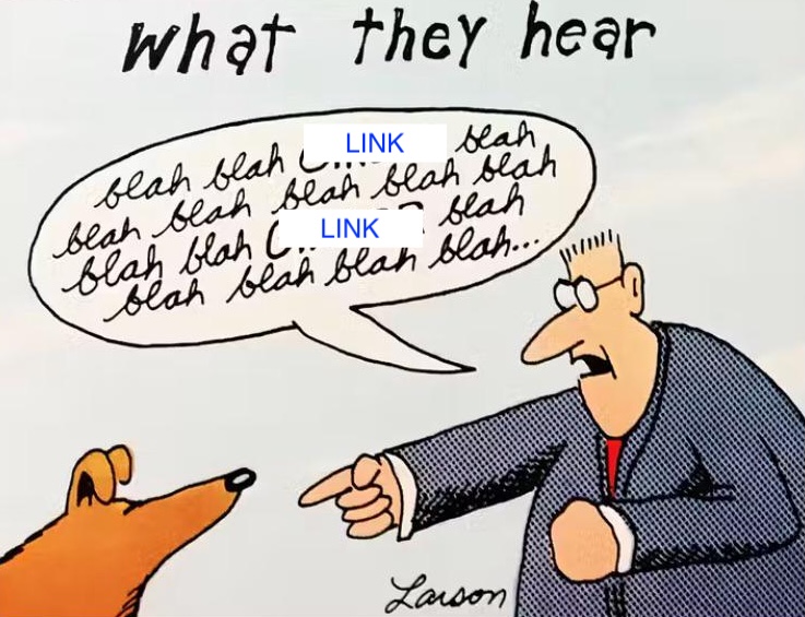
Here’s the truth: nobody has read those paragraphs. To rip off a Far Side cartoon, here’s what most users get from a paragraph of text:
Don’t take my word for it. Here’s what Joel Spolsky wrote in Designing for People Who Have Better Things To Do With Their Lives:
In fact, users don’t read anything .
This may sound a little harsh, but you’ll see, when you do usability tests, that there are quite a few users who simply do not read words that you put on the screen. If you pop up an error box of any sort, they simply will not read it. This may be disconcerting to you as a programmer, because you imagine yourself as conducting a dialog with the user. Hey, user! You can’t open that file, we don’t support that file format! Still, experience shows that the more words you put on that dialog box, the fewer people will actually read it.
Or, more prosaically, Alex Hope writes in I give you feedback on your blog post draft but you don’t send it to me:
Basically, if your reader sees a wall of text, their brain will activate the evolutionary survival mechanism they have developed to instantly panic-close that tab, before the wall of text jumps out of the page and hecking eats them.
The solution is fairly easy. Remove all the text that isn’t a link.
But isn’t that going to leave a mostly empty page? No! Links are why people come to a documentation home page. They want to find out how to use some feature or to learn whether or not a feature exists. And you want to help them find the page that really digs into the detail of the feature they are interested in. So instead of paragraphs of text, add more links.
But don’t add links randomly. Your documentation has structure and that structure should be reflected in the menu of links. Headings, bullet point lists, sub lists and that sort of thing really help. Here’s my new design for the OpenSSL Documentation homepage:
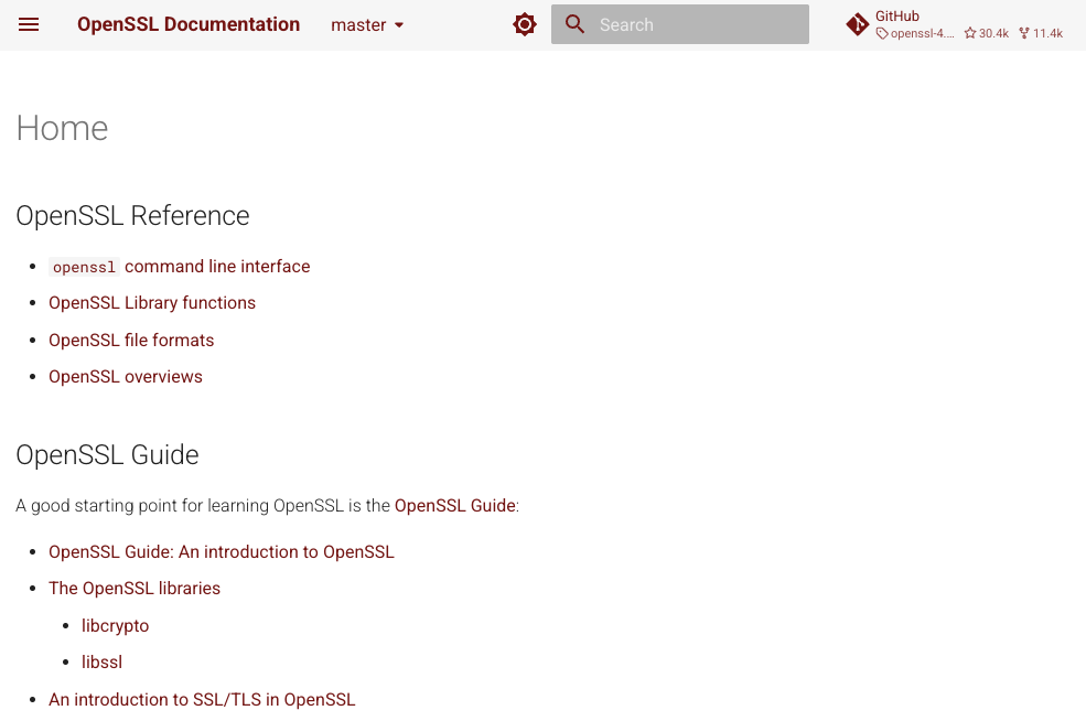
I’m not entirely happy with it yet, but it’s way better than what was there before. I’m not saying the people who wrote the previous version were bad at their job. Far from it! Instead they put tons of work on fleshing out the actual reference pages, which are the actually important bits of documentation. The downside of knowing OpenSSL inside and out is that it’s harder to put yourself in the shoes of someone arriving on the homepage for the first time.
A couple of notes that aren’t quite so critical
- The old page mentioned OpenSSL 3.0 and even linked to a page in the 3.0 documentation. It probably made sense when the page was written, but didn’t age well. We’re on 4.0! Looking at the analytics, I see a lot of traffic to 3.0 pages which are horribly out of date. Link to the “master” version instead unless there is something that absolutely only exists on a specific version. People will find the older documentation on their own if they need it.
- While duplicating the site navigation is better than paragraphs, good documentation anticipates the needs of the audience. In this case, I pulled out the OpenSSL Guide content because I assume someone who is visiting the documentation home page needs help getting started. People who already know OpenSSL skip the home page and go directly to the page they need to move on.